
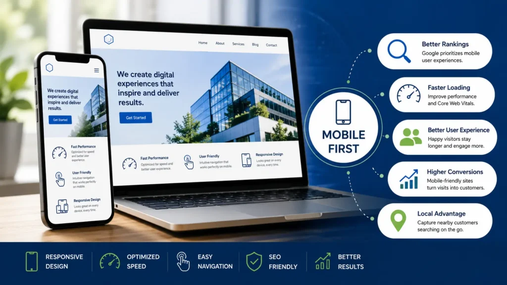
The digital landscape has evolved significantly over the last several years, with smartphones becoming the preferred device for accessing the internet. Whether people are shopping online, researching services, reading blogs, or contacting local businesses, mobile devices now dominate online activity. As consumer habits continue to shift toward mobile browsing, businesses must ensure their websites provide an exceptional experience on smaller screens.
Google has adapted to this change by introducing mobile-first indexing, a system that primarily evaluates the mobile version of a website when determining its position in search results. This means that a website with poor mobile usability may struggle to achieve strong rankings, regardless of how well its desktop version performs.
For businesses aiming to improve their online visibility and deliver a better experience to visitors, embracing a mobile-first approach is no longer a luxury—it’s a necessity. In this guide, we’ll discuss why Google emphasizes mobile-friendly websites, the benefits of mobile-first design, and the best practices businesses should follow to remain competitive in today’s search landscape.
What Does Mobile-First Website Design Mean?
Mobile-first website design is a development strategy that starts with designing for smartphones before expanding layouts for tablets and desktop computers. Instead of creating a desktop website first and trying to adapt it for smaller screens, designers begin with the mobile experience and progressively enhance the design for larger devices.
This approach ensures that the most important information and functionality remain accessible regardless of screen size. It also encourages clean layouts, straightforward navigation, and faster performance—all of which contribute to a better user experience.
By prioritizing mobile users from the outset, businesses create websites that are easier to use and more adaptable across multiple devices.
Google’s Shift to Mobile-First Indexing
Google introduced mobile-first indexing in response to changing browsing habits worldwide. Since the majority of users now search the web using smartphones, Google’s search engine primarily crawls and indexes the mobile version of a website rather than its desktop counterpart.
When determining rankings, Google evaluates several aspects of the mobile site, including:
- Website content
- Mobile usability
- Loading performance
- Technical SEO
- Overall page experience
If essential content is missing from the mobile version or the website provides a poor user experience, search visibility can be negatively affected.
This approach ensures that search results reflect the experience most users actually receive when visiting websites on mobile devices.
Why Mobile-Friendly Websites Matter
Mobile Browsing Continues to Grow
Smartphones have become the primary gateway to the internet for billions of people worldwide. Consumers regularly use mobile devices to:
- Search for nearby businesses
- Compare products and services
- Read customer reviews
- Make online purchases
- Schedule appointments
- Contact companies
- Consume digital content
Businesses that fail to optimize for mobile risk losing valuable visitors to competitors offering a smoother browsing experience.
Enhanced User Experience
A positive user experience is one of the most important factors in retaining website visitors. Mobile users expect websites to function quickly and efficiently without unnecessary frustration.
An effective mobile website should provide:
- Fast-loading pages
- Easy-to-read content
- Intuitive navigation
- Responsive layouts
- Clearly visible buttons
- Streamlined forms
When visitors can quickly find what they’re looking for, they’re more likely to stay engaged and complete desired actions.
Better Search Engine Visibility
A mobile-optimized website supports stronger search engine optimization by improving technical performance and user engagement.
Benefits include:
- Improved crawlability
- Better indexing
- Faster page speed
- Stronger Core Web Vitals
- Lower bounce rates
- Increased time spent on site
Together, these improvements can help businesses achieve higher rankings and attract more organic traffic.
Essential Components of Mobile-First Website Design
Responsive Layouts
Responsive design allows websites to automatically adjust their appearance based on the visitor’s screen size. Whether someone accesses the website from a smartphone, tablet, laptop, or desktop computer, the layout remains functional and visually appealing.
A responsive website eliminates the need to maintain separate versions for different devices while ensuring a consistent brand experience.
Optimized Website Speed
Loading speed plays a critical role in both user satisfaction and SEO performance. Mobile users are often less patient than desktop users and may abandon a website if it takes too long to load.
Ways to improve website speed include:
- Compressing image files
- Reducing unnecessary code
- Leveraging browser caching
- Using content delivery networks (CDNs)
- Optimizing server response times
- Implementing lazy loading for images
Fast-loading websites create a smoother browsing experience and encourage users to remain on the site longer.
User-Friendly Navigation
Since mobile screens offer limited space, navigation should be kept simple and organized.
Good mobile navigation features:
- Easy-to-access menus
- Logical page hierarchy
- Clear labels
- Search functionality
- Minimal scrolling through menus
Visitors should be able to locate information quickly without unnecessary confusion.
Readable Content
Content should remain comfortable to read on smaller screens.
Best practices include:
- Appropriate font sizes
- High color contrast
- Short paragraphs
- Informative headings
- Bullet points where relevant
- Adequate spacing between elements
Readable content encourages users to continue exploring the website.
Touch-Optimized Interface
Unlike desktop users who rely on a mouse, mobile visitors navigate using touch gestures.
To improve usability:
- Increase button sizes
- Leave enough spacing between clickable elements
- Make forms easy to complete
- Avoid tiny links
- Ensure interactive elements respond smoothly
These adjustments reduce user frustration and improve overall accessibility.
Core Web Vitals and Mobile Performance
Google uses Core Web Vitals to measure important aspects of website performance and user experience.
These metrics include:
Largest Contentful Paint (LCP)
Measures how quickly the main content becomes visible.
Interaction to Next Paint (INP)
Evaluates how quickly the website responds to user interactions.
Cumulative Layout Shift (CLS)
Measures visual stability by tracking unexpected movement of page elements during loading.
Optimizing these performance indicators contributes to both better rankings and a superior browsing experience.
Mobile SEO Best Practices
To maximize online visibility, businesses should combine responsive design with strong technical SEO strategies.
Recommended practices include:
Compress and Optimize Images
Large image files can slow websites considerably. Use modern image formats and properly sized graphics to improve loading performance.
Implement Structured Data
Schema markup helps search engines understand website content more effectively and may enhance search listings with rich results.
Limit Intrusive Pop-Ups
Pop-ups that obstruct the main content can negatively impact the mobile user experience. Use banners or less disruptive promotional elements whenever possible.
Maintain Content Consistency
The mobile version of your website should include the same valuable content available on desktop. Missing pages or incomplete information may affect indexing and search performance.
Mobile Design Improves Conversions
An effective mobile website doesn’t simply attract visitors—it helps convert them into customers.
Businesses can increase conversions by incorporating features such as:
- Click-to-call buttons
- Simplified contact forms
- Clear calls to action
- Fast checkout processes
- Easy appointment booking
When users encounter fewer obstacles, they’re more likely to complete purchases, submit enquiries, or request services.
Common Mobile Website Mistakes
Many websites lose traffic because of avoidable mobile usability issues.
Some of the most common mistakes include:
- Slow page loading
- Tiny fonts that require zooming
- Confusing navigation
- Small tap targets
- Excessive pop-ups
- Unoptimized images
- Cluttered page layouts
Addressing these problems improves both user satisfaction and search engine performance.
Why Mobile-First Design Is Crucial for Local Businesses
Local customers frequently search for businesses while they’re on the move. Whether they’re looking for nearby services, checking reviews, or requesting directions, mobile devices play a significant role in local search behavior.
A responsive, fast-loading website helps businesses capture these high-intent visitors and strengthens their local SEO efforts. Companies that deliver an outstanding mobile experience are more likely to earn customer trust and generate enquiries from nearby audiences.
The Future of Mobile Website Design
As technology advances, mobile website design will continue to evolve.
Emerging trends include:
- Voice search optimization
- Progressive Web Apps (PWAs)
- AI-powered personalization
- Improved accessibility standards
- Faster web technologies
- Interactive mobile experiences
- Dark mode compatibility
Businesses that embrace these innovations will be better positioned to meet changing user expectations and maintain a competitive advantage.
Conclusion
Mobile-first website design has become a fundamental requirement for businesses that want to succeed online. Since Google now evaluates websites primarily through their mobile versions, delivering a fast, responsive, and user-friendly experience is essential for achieving strong search rankings.
Investing in mobile optimization not only enhances SEO but also improves user satisfaction, builds trust, increases engagement, and drives more conversions. By focusing on responsive layouts, faster loading times, accessible navigation, and technical performance, businesses can create websites that perform effectively across every device.
As mobile internet usage continues to grow, adopting a mobile-first strategy will help businesses remain competitive and provide visitors with the seamless digital experience they expect.
Build a Mobile-Optimized Website with Horizon Services
If your website isn’t providing the mobile experience today’s users expect, now is the ideal time to upgrade. Horizon Services is a Watford-based full-service digital agency that creates responsive, high-performance websites designed to support your business goals while following modern SEO and usability standards.
If you’re searching for a reliable web design and development agency in Watford, our experienced team can help you with professional website design, custom development, eCommerce solutions, search engine optimisation, and ongoing website support. Contact Horizon Services today to build a website that performs exceptionally on every device and helps your business grow online.


