
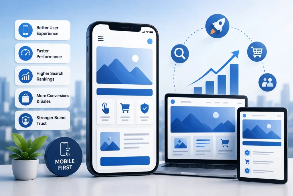
The way people interact with digital platforms has changed dramatically over the past decade. Smartphones are now the preferred device for browsing websites, shopping online, booking appointments, and engaging with brands. Because of this shift, businesses can no longer rely solely on desktop-focused designs. They must prioritize mobile experiences to meet evolving customer expectations.
This growing dependence on mobile devices has made mobile-first UX design a fundamental part of digital success. Companies that create seamless and user-friendly mobile experiences are more likely to attract visitors, retain customers, and improve overall business performance.
Understanding Mobile-First UX Design
Mobile-first UX design is a strategy where designers begin creating digital experiences for smartphones before adapting them to larger screens such as tablets and desktops. Instead of building a desktop version first and shrinking it down later, the process starts with the smallest screen in mind.
This approach encourages businesses to focus on essential content, intuitive navigation, and smooth functionality from the beginning. Since mobile users typically want quick access to information, mobile-first design emphasizes simplicity, speed, and usability.
The result is a cleaner and more effective user experience across every device.
The Growing Importance of Mobile Devices
Smartphones have transformed how consumers search for information and interact with businesses online. People now use mobile devices for almost everything, including comparing products, reading reviews, communicating with brands, and making purchases.
Because mobile browsing has become such a major part of everyday life, users expect websites and applications to perform flawlessly on smaller screens. If a website loads slowly or feels difficult to navigate, users often leave immediately and look elsewhere.
Modern businesses must recognize that mobile usability directly impacts customer satisfaction and online success.
Why Mobile-First UX Design Matters for Businesses
Enhances the Overall User Experience
A smooth user experience is essential for keeping visitors engaged. Mobile-first UX design helps businesses create interfaces that are easy to use, visually appealing, and highly functional on smartphones.
By prioritizing mobile usability, companies can simplify navigation, improve readability, and make interactions more intuitive. Features like responsive layouts, accessible menus, and touch-friendly buttons help users complete tasks quickly and efficiently.
When customers enjoy using a website, they are more likely to stay longer, interact with the brand, and return in the future.
Improves Website Speed and Performance
Mobile users expect websites to load almost instantly. Slow-loading pages can frustrate visitors and lead to high bounce rates.
Mobile-first design encourages developers to optimize performance from the start. This often includes compressing images, reducing unnecessary elements, streamlining code, and improving page responsiveness.
Fast websites create better user experiences and contribute to higher engagement levels. Additionally, improved performance can positively influence search engine visibility.
Supports Better Search Engine Rankings
Search engines such as Google prioritize websites that deliver strong mobile experiences. Since mobile-first indexing is now the standard, the mobile version of a website plays a major role in determining search rankings.
Websites that are optimized for mobile devices often achieve better SEO results because they provide faster load times, improved usability, and enhanced accessibility.
Higher search rankings can help businesses increase organic traffic and generate more leads online.
Mobile-First UX Helps Increase User Engagement
Easier Navigation
Navigation is one of the most important aspects of user experience. Mobile-first design focuses on creating streamlined navigation systems that allow users to find information quickly.
Simple menus, organized layouts, and clear call-to-action buttons help visitors move through a website without confusion.
Better Content Readability
Reading content on smaller screens can become frustrating if the design is cluttered or poorly formatted. Mobile-first UX design prioritizes clean typography, balanced spacing, and structured layouts that improve readability.
Businesses that present information clearly can communicate more effectively with their audience.
Touch-Optimized Interactions
Mobile users rely on taps and gestures rather than mouse clicks. Mobile-first interfaces are designed with touch interaction in mind, ensuring buttons and interactive elements are easy to access and use.
This improves convenience and creates a smoother browsing experience.
Mobile Commerce Continues to Expand
Online shopping through smartphones has grown significantly in recent years. Consumers frequently use mobile devices to browse products, compare prices, and complete purchases.
Businesses that fail to provide optimized mobile shopping experiences may struggle with lower sales and higher cart abandonment rates.
Mobile-first UX design helps improve every stage of the customer journey, from product discovery to checkout. Simplified payment systems, responsive product pages, and easy navigation can all contribute to increased conversions.
For e-commerce businesses, mobile optimization is directly tied to revenue growth and customer retention.
Builds Trust and Brand Reputation
A website often serves as the first impression of a business. If users encounter outdated layouts, slow pages, or difficult navigation, they may question the credibility of the brand.
Mobile-first UX design helps businesses create polished and professional digital experiences that build trust with visitors. Consistent performance across devices also strengthens brand identity and improves customer confidence.
A well-designed mobile experience shows that a business values user convenience and modern digital standards.
Gives Businesses a Competitive Edge
In competitive industries, user experience can become a major differentiator. Businesses that invest in mobile-first design are better positioned to attract and retain customers compared to competitors with outdated websites.
A high-quality mobile experience can help businesses:
- Increase customer engagement
- Improve conversion rates
- Reduce bounce rates
- Enhance customer loyalty
- Strengthen online visibility
Companies that prioritize mobile usability are more likely to stand out in crowded digital markets.
Mobile-First UX Encourages Accessibility
Accessibility is an essential part of modern web design. Mobile-first UX design often leads to cleaner layouts and more user-friendly interfaces that benefit a wider range of users.
Features like readable fonts, proper color contrast, responsive layouts, and accessible navigation improve usability for people with different needs and abilities.
Accessible design not only expands audience reach but also demonstrates a commitment to inclusive user experiences.
Responsive Design and Mobile Optimization
Responsive design works closely with mobile-first principles by ensuring websites adapt smoothly to different screen sizes.
A responsive website automatically adjusts images, layouts, and content based on the device being used. This creates a consistent and enjoyable experience whether users browse from smartphones, tablets, or desktops.
Responsive design has become a standard expectation for businesses that want to provide professional digital experiences.
Essential Elements of Mobile-First UX Design
Strong Visual Structure
An effective mobile interface guides users toward important information and actions through clear design hierarchy and spacing.
Minimal and Clean Layouts
Too much content or visual clutter can overwhelm users on smaller screens. Mobile-first design focuses on simplicity and functionality.
Optimized Loading Speed
Performance remains a top priority. Faster websites help improve engagement, SEO rankings, and overall customer satisfaction.
User-Friendly Forms
Mobile forms should be simple, concise, and easy to complete. Features like autofill and fewer input fields improve usability.
Consistent Experience Across Devices
Consistency in design elements such as typography, colors, and navigation creates familiarity and strengthens the user experience.
The Future of Mobile-First Experiences
Technology continues evolving, and mobile experiences will become even more advanced in the coming years. Innovations such as voice interfaces, AI-powered personalization, wearable devices, and progressive web applications are shaping the future of UX design.
Businesses that invest in mobile-first strategies today will be better prepared to adapt to future digital trends and changing customer expectations.
Companies that ignore mobile optimization risk losing customers and online visibility as mobile usage continues growing worldwide.
Why Professional UX Design Services Matter
Building an effective mobile-first experience requires expertise in user behavior, interface design, usability testing, and responsive development. Professional designers understand how to create experiences that balance user satisfaction with business objectives. Understanding the significance of UX research is essential in this process, as it helps identify user needs, behaviors, and pain points before design decisions are made, resulting in more intuitive and effective digital experiences. Businesses that recognize the advantages of professional UI/UX design services are better positioned to create digital products that improve usability, increase engagement, and support long-term growth.
Working with an experienced agency can help businesses develop digital platforms that improve engagement, increase conversions, and strengthen brand identity.
If your business wants to deliver modern and high-performing digital experiences, partnering with a professional UI/UX design company in Watford like Horizon Services can help you achieve long-term success. We provide comprehensive digital services designed to help businesses create impactful and user-focused online experiences.
Final Thoughts
Mobile-first UX design has become a vital component of digital success in the modern business environment. As mobile usage continues to dominate online activity, businesses must prioritize user-friendly and responsive mobile experiences.
By investing in mobile-first strategies, companies can improve customer satisfaction, increase online visibility, boost engagement, and drive higher conversions. From better performance and accessibility to stronger branding and improved SEO, mobile-first UX design delivers long-term benefits that help businesses remain competitive in an increasingly digital world.


