
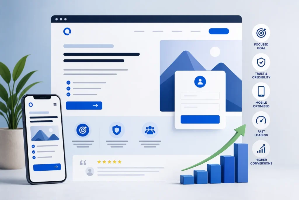
Generating website traffic is only half the battle in digital marketing. The real challenge begins when visitors arrive on your landing page. If that page fails to engage, build trust, and encourage action, even the most successful advertising campaigns can produce disappointing results.
A landing page serves a single purpose: persuading visitors to complete a specific action. Whether you want users to request a quote, subscribe to your newsletter, schedule a consultation, or purchase a product, every element on the page should work together to support that objective.
The most successful landing pages don’t rely on flashy graphics or complicated layouts. Instead, they focus on delivering a clear message, providing an excellent user experience, and removing obstacles that prevent conversions.
Below are proven landing page design strategies that can help you convert more visitors into valuable leads and customers.
Define One Primary Conversion Goal
One of the biggest reasons landing pages underperform is that they attempt to achieve several objectives at once. When visitors are presented with too many options, they often choose none of them.
Before designing your page, decide exactly what action you want users to take. It could be downloading a guide, booking a service, requesting pricing, or making a purchase.
Once you’ve identified that goal, make sure every section of the page supports it. Eliminating unnecessary navigation links and unrelated content helps keep visitors focused and increases the likelihood of conversion.
Write Headlines That Capture Attention Immediately
Your headline is the first message visitors read, and it often determines whether they’ll continue exploring the page.
An effective headline should clearly communicate the value you’re offering instead of relying on vague marketing language. Visitors should instantly understand how your product or service solves their problem.
Keep headlines concise, relevant, and benefit-oriented. Supporting subheadings can then provide additional information that encourages users to keep reading.
Focus on Customer Benefits Rather Than Business Features
Many businesses spend too much time talking about themselves instead of addressing customer needs.
Rather than simply listing features, explain how those features improve the visitor’s situation.
For example, instead of highlighting advanced technology, explain how it saves time, reduces costs, improves productivity, or simplifies everyday tasks.
People ultimately invest in solutions, not features.
Keep Your Page Layout Simple
A clean and organised design allows visitors to absorb information without feeling overwhelmed.
Avoid clutter by limiting unnecessary graphics, decorative elements, and competing messages. Strategic use of white space makes content easier to read and naturally guides users toward important sections.
Simple layouts also improve accessibility across different devices and create a more professional appearance.
Invest in High-Quality Images
Visual content significantly influences first impressions.
Authentic photographs of your products, employees, office, or completed projects help establish credibility. If suitable, short videos explaining your service or demonstrating your product can further increase engagement.
Avoid generic stock photography whenever possible, as original visuals typically create stronger trust with potential customers.
Design a Strong Call-to-Action
Your call-to-action (CTA) is where conversions happen, so it deserves special attention.
Buttons should be easy to locate, visually distinct from the rest of the page, and written using action-focused language.
Instead of generic phrases like “Submit,” use wording that explains the value visitors receive, such as:
- Get My Free Quote
- Schedule a Consultation
- Download Your Free Guide
- Start Today
On longer landing pages, placing multiple CTA buttons throughout the content makes it easier for visitors to take action whenever they’re ready.
Optimise for Mobile Users
With a large percentage of users browsing on smartphones and tablets, mobile optimisation is no longer optional.
Your landing page should automatically adapt to different screen sizes while maintaining excellent usability.
Pay attention to:
- Readable text sizes
- Fast-loading images
- Large tap-friendly buttons
- Simple navigation
- Easy-to-complete forms
Testing your landing page across multiple devices helps ensure a consistent experience for every visitor.
Improve Loading Speed
Website performance directly impacts user behaviour.
Slow-loading pages often result in visitors abandoning the site before they’ve even viewed your offer. Understanding why page speed optimization is necessary can help businesses appreciate how faster websites not only improve user experience but also increase conversions and support better search engine rankings.
Improve page speed by:
- Compressing image files
- Removing unnecessary scripts
- Minimising code
- Using browser caching
- Selecting reliable web hosting
A faster website creates a smoother experience while also supporting search engine visibility.
Build Credibility with Trust Signals
Visitors are naturally cautious when interacting with unfamiliar businesses.
Adding trust elements throughout your landing page helps reassure potential customers that they’re making a safe decision.
Useful trust signals include:
- Genuine customer testimonials
- Case studies
- Review ratings
- Client logos
- Industry certifications
- Awards and recognitions
- Security badges
Authentic social proof can significantly influence purchasing decisions.
Reduce Friction with Short Forms
Every additional field in a form increases the effort required to convert.
Ask only for information that’s genuinely necessary. For most lead generation campaigns, collecting a name, email address, and phone number is sufficient.
Simplifying forms encourages more visitors to complete them without feeling overwhelmed.
Ensure Message Consistency
Visitors expect the content on your landing page to match the advertisement or search result that brought them there.
If your ad promotes a free consultation, your landing page should immediately reinforce that same offer.
Maintaining consistency between advertisements, headlines, visuals, and messaging helps build confidence and reduces confusion.
Remove Anything That Distracts Visitors
Every unnecessary link or design element creates another opportunity for visitors to leave your page.
Consider reducing or removing:
- Full navigation menus
- Sidebar widgets
- External links
- Social media icons
- Irrelevant promotions
A focused landing page keeps users moving toward your desired action.
Use Visual Direction to Guide Attention
Good design subtly directs visitors toward important information.
Images showing people looking toward your call-to-action, directional arrows, contrasting colours, and thoughtful spacing all help create a natural flow through the page.
These visual cues improve usability without making the design feel overly promotional.
Answer Common Questions
Many potential customers hesitate simply because they still have unanswered questions.
Adding a frequently asked questions section can eliminate common objections before they prevent a conversion.
Topics might include:
- Pricing
- Service timelines
- Guarantees
- Support availability
- Payment options
- Cancellation policies
Providing clear answers builds confidence and reduces uncertainty.
Create Genuine Urgency
Encouraging visitors to act sooner rather than later can improve conversion rates.
Examples include:
- Limited-time promotions
- Seasonal offers
- Early-bird discounts
- Exclusive bonuses
- Limited appointment availability
Any urgency should be honest and transparent, as misleading tactics can damage customer trust.
Maintain Consistent Branding
Your landing page should reflect your overall brand identity.
Using consistent colours, typography, imagery, and messaging strengthens brand recognition and creates a more professional experience.
Visitors should immediately recognise they’re interacting with the same business across your advertisements, website, and landing pages.
Test, Measure, and Improve
Even well-designed landing pages can often perform better with ongoing optimisation.
A/B testing allows you to compare different versions of headlines, layouts, CTA buttons, colours, images, and forms to discover what resonates most with your audience.
Small improvements made consistently can produce significant long-term gains in conversion rates.
Mistakes That Often Reduce Conversions
To maximise performance, avoid these common landing page errors. Many of these issues fall under the broader category of common website design mistakes that hurt conversions. Understanding the impact of poor website navigation is particularly important, as confusing menus, distracting links, and unclear user journeys can create friction, reduce trust, and make it harder for visitors to complete your desired action.
- Confusing headlines
- Multiple competing offers
- Slow page speeds
- Poor mobile usability
- Long and complicated forms
- Weak calls-to-action
- Lack of customer reviews
- Overuse of stock imagery
- Too much on-page clutter
- Unclear value propositions
Addressing these issues can make a noticeable difference in user engagement and lead generation.
Conclusion
An effective landing page combines persuasive messaging, thoughtful design, fast performance, and a seamless user experience to encourage visitors to take action. By simplifying your layout, focusing on customer benefits, improving trust, optimising for mobile devices, and continually testing your pages, you can create landing experiences that consistently generate more leads and sales.
Successful businesses understand that landing page optimisation isn’t a one-time task. Continuous testing and refinement help ensure your pages keep delivering strong results as customer expectations and digital trends evolve.
If you’re ready to create landing pages that not only look professional but also drive measurable business growth, Horizon Services is here to help. As a full-service digital agency based in Watford, UK, we specialise in designing conversion-focused landing pages tailored to your business objectives. Discover our landing page design services in Watford and let our team help you turn more website visitors into loyal customers.


