
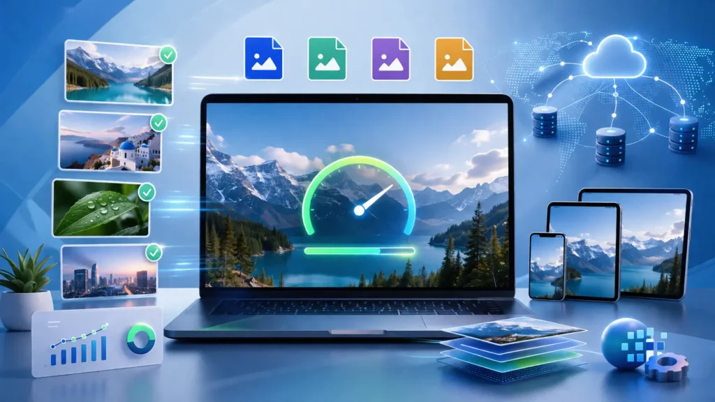
Website speed has become one of the most important factors in determining online success. Whether you’re running an eCommerce store, a business website, or a personal blog, visitors expect pages to load almost instantly. Research consistently shows that slow-loading websites lead to higher bounce rates, lower engagement, and reduced conversion rates.
One of the biggest contributors to slow websites is unoptimized images. While high-quality visuals enhance user experience and make content more engaging, they can also consume significant bandwidth if they are not properly optimized. Fortunately, image optimization techniques allow you to maintain excellent visual quality while dramatically improving loading speed.
In this guide, we’ll explore the most effective image optimization strategies that help create faster, SEO-friendly websites while delivering a better experience for users across desktop and mobile devices.
Why Image Optimization Matters
Images often account for more than half of a webpage’s total size. Large, uncompressed images require more data to download, increasing page load times. Since both users and search engines prioritize fast websites, image optimization has become an essential part of technical SEO.
Benefits of image optimization include:
- Faster page loading speeds
- Improved Core Web Vitals performance
- Better mobile user experience
- Higher search engine rankings
- Reduced server bandwidth usage
- Increased conversion rates
- Lower bounce rates
- Improved accessibility
Search engines like Google consider page speed and user experience as ranking signals. Optimized images contribute directly to these metrics, making them a valuable investment for long-term SEO success.
Choose the Right Image Format
Selecting the appropriate image format is the first step toward optimization.
JPEG
JPEG remains one of the most popular formats for photographs and complex images. It offers excellent compression while maintaining acceptable image quality.
Best used for:
- Product photos
- Blog images
- Hero banners
- Photography
PNG
PNG provides lossless compression and supports transparency. However, PNG files are generally larger than JPEG images.
Best used for:
- Logos
- Icons
- Graphics
- Images requiring transparent backgrounds
WebP
WebP has become a preferred format because it delivers significantly smaller file sizes without noticeable quality loss.
Advantages include:
- Smaller file sizes
- High-quality compression
- Transparency support
- Faster page loading
AVIF
AVIF is one of the newest image formats offering exceptional compression efficiency and outstanding image quality.
Benefits include:
- Smaller files than WebP
- Superior image quality
- Improved loading performance
When browser compatibility allows, WebP and AVIF should be prioritized for modern websites.
Resize Images Before Uploading
Uploading oversized images is one of the most common website performance mistakes.
For example, displaying a 4000 × 3000 pixel image inside a 700-pixel container wastes bandwidth because visitors still download the full-sized image.
Always resize images according to their display dimensions.
Recommended practices include:
- Blog featured images: around 1200px wide
- Product images: 800–1200px
- Thumbnails: 300–500px
- Icons: SVG whenever possible
Smaller dimensions reduce download size without sacrificing visible quality.
Compress Images Without Losing Quality
Image compression removes unnecessary data while preserving visual appearance.
There are two main compression methods:
Lossless Compression
Lossless compression preserves every image detail while reducing file size.
Suitable for:
- Logos
- Graphics
- Illustrations
- UI elements
Lossy Compression
Lossy compression removes less noticeable image information to achieve much smaller files.
Ideal for:
- Photography
- Lifestyle images
- Marketing banners
- Blog content
Most websites benefit from moderate lossy compression because visitors rarely notice the difference, while loading speeds improve substantially.
Implement Responsive Images
Modern websites serve visitors using a wide variety of screen sizes.
Rather than loading one large image for every device, responsive images allow browsers to select the most appropriate image size.
Benefits include:
- Reduced mobile bandwidth
- Faster loading
- Better Core Web Vitals
- Improved user experience
Using responsive image techniques ensures smartphones don’t download desktop-sized assets unnecessarily.
Enable Lazy Loading
Lazy loading delays image downloads until users scroll near them.
Instead of loading every image immediately, only above-the-fold images load first.
Advantages include:
- Faster initial page load
- Reduced bandwidth usage
- Improved Largest Contentful Paint (LCP)
- Better user experience
Most modern content management systems now support native lazy loading with minimal configuration.
Optimize Image File Names
Many websites upload images using names like:
- IMG001.jpg
- DSC1023.png
- Screenshot123.webp
These names provide no SEO value.
Instead, use descriptive, keyword-rich filenames.
Examples:
- blue-running-shoes.webp
- modern-office-interior.jpg
- wordpress-speed-optimization.png
Search engines use filenames as one signal to understand image content.
Write Descriptive Alt Text
Alternative text (alt text) improves both accessibility and SEO.
Screen readers rely on alt text to describe images to visually impaired users.
Good alt text should:
- Accurately describe the image
- Include relevant keywords naturally
- Remain concise
- Avoid keyword stuffing
Example:
“Professional web designer creating responsive website layouts.”
Poor example:
“website web design company SEO website design digital marketing website”
Natural descriptions perform better for both accessibility and search engines.
Use Image CDNs
Content Delivery Networks (CDNs) distribute images across global servers.
Visitors automatically receive images from the nearest server location, reducing latency.
Benefits include:
- Faster international loading
- Reduced server load
- Automatic image optimization
- Improved reliability
Many modern CDNs also convert images into next-generation formats like WebP or AVIF automatically.
Leverage Browser Caching
Browser caching stores images locally after the first visit.
When users return, previously downloaded images load almost instantly instead of being downloaded again.
Proper caching improves:
- Repeat visitor experience
- Website speed
- Server efficiency
Caching policies should be configured according to your website’s update frequency.
Optimize Hero Images
Hero images often become the Largest Contentful Paint (LCP) element, making them one of the most important images to optimize.
Best practices include:
- Compress aggressively
- Use modern formats
- Resize appropriately
- Preload critical hero images
- Avoid unnecessarily large backgrounds
Improving hero image performance has a direct impact on Core Web Vitals.
Use SVG for Icons and Graphics
SVG graphics are vector-based rather than pixel-based.
Advantages include:
- Infinitely scalable
- Tiny file sizes
- Sharp on all devices
- Easy customization using CSS
SVG works particularly well for:
- Logos
- Social media icons
- Navigation icons
- Infographics
- Simple illustrations
Create Image Sitemaps
Image sitemaps help search engines discover visual content that may otherwise be difficult to crawl.
This is especially useful for:
- eCommerce websites
- Photography portfolios
- Travel websites
- Recipe blogs
Better indexing can improve visibility in image search results.
Avoid Decorative Images That Add No Value
Not every section needs a large stock image.
Consider whether each image actually contributes to user understanding.
Removing unnecessary visuals can:
- Reduce page weight
- Improve readability
- Increase loading speed
- Enhance user experience
A clean, focused design often performs better than pages overloaded with decorative graphics.
Optimize Images for Mobile Devices
With mobile traffic dominating many industries, optimization for smartphones is essential.
Recommendations include:
- Use responsive images
- Compress aggressively
- Minimize large backgrounds
- Test loading speed on slower connections
- Prioritize above-the-fold content
Mobile-first optimization supports both SEO and user satisfaction.
Monitor Performance Regularly
Image optimization is an ongoing process rather than a one-time task.
Regularly monitor:
- Page speed
- Largest Contentful Paint (LCP)
- Cumulative Layout Shift (CLS)
- Image download sizes
- Mobile performance
Periodic audits help identify newly uploaded images that may slow your website.
Common Image Optimization Mistakes
Avoid these frequent issues:
- Uploading original camera images
- Ignoring modern image formats
- Missing alt text
- Oversized hero banners
- Using PNG when JPEG or WebP is sufficient
- Failing to compress images
- Not implementing lazy loading
- Generic file names
- Missing responsive image support
Eliminating these mistakes can significantly improve website performance.
Final Thoughts
Image optimization is one of the simplest yet most effective ways to improve website performance, user experience, and search engine visibility. By choosing the right file formats, compressing images, enabling lazy loading, implementing responsive images, and following SEO best practices, businesses can achieve faster loading times without compromising visual quality.
As Google’s ranking algorithms continue to prioritize speed and user experience, optimized images are no longer optional—they’re an essential component of every successful website. Investing time in image optimization today can lead to better search rankings, higher engagement, and increased conversions in the long run.
Ready to Build a Faster, SEO-Friendly Website?
If you’re looking to improve your website’s performance, search visibility, and user experience, partnering with experienced professionals can make all the difference. Horizon Services is a Watford, UK-based full-service digital agency specializing in modern, high-performing websites tailored to business growth.
Learn more about our website design and development company in Watford services and discover how we can create a fast, visually engaging, and SEO-optimized website that helps your business stand out online.


