
In today’s competitive digital landscape, a visually appealing website is no longer enough to secure top search engine rankings. Users expect websites to load quickly, respond instantly, and provide a seamless browsing experience across every device. Google recognizes these expectations and rewards websites that prioritize user experience through its Core Web Vitals ranking signals.
For web designers, understanding Core Web Vitals is no longer optional—it is an essential part of creating websites that perform well in search results while delivering an exceptional user experience. Whether you’re designing a corporate website, eCommerce platform, or service-based business site, optimizing these performance metrics can improve engagement, increase conversions, and strengthen your online presence.
This guide explains Core Web Vitals from a designer’s perspective, covering what they are, why they matter, and practical strategies to improve them.
What Are Core Web Vitals?
Core Web Vitals are a set of user experience metrics introduced by Google to evaluate how visitors perceive the performance of a website. Instead of focusing solely on speed, these metrics measure the real-world experience users have while interacting with your pages.
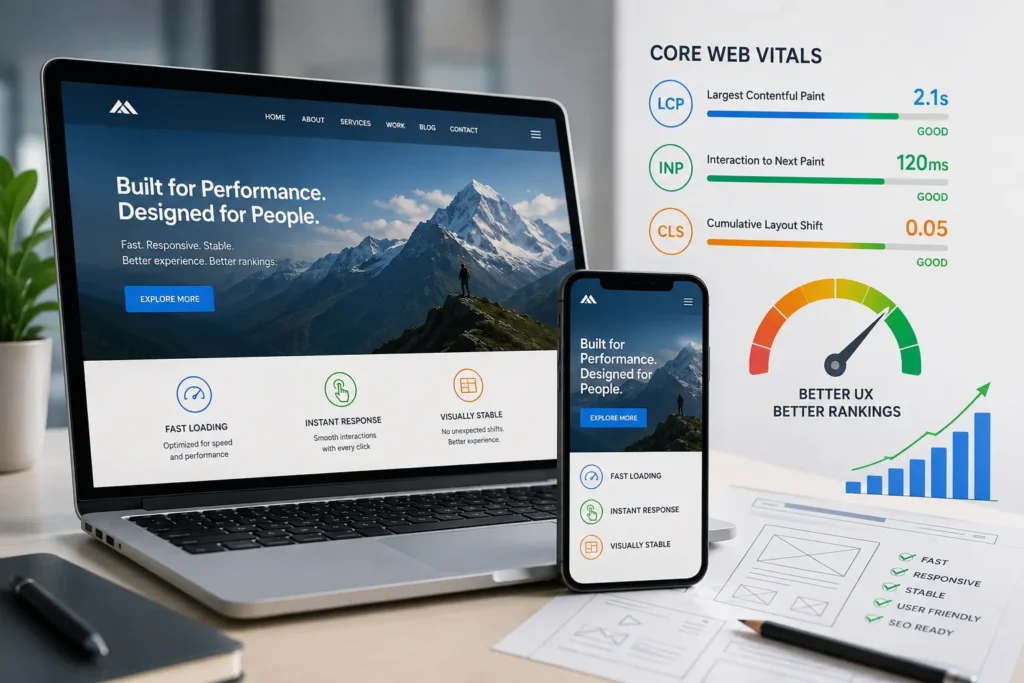
Google currently focuses on three primary performance indicators:
- Largest Contentful Paint (LCP) – Loading performance
- Interaction to Next Paint (INP) – Responsiveness
- Cumulative Layout Shift (CLS) – Visual stability
Together, these metrics provide a comprehensive picture of how usable and enjoyable your website is.
Why Core Web Vitals Matter for SEO
Google’s mission is to deliver the best possible experience for search users. Websites that load quickly and function smoothly tend to keep visitors engaged longer, reducing bounce rates and increasing satisfaction.
Although Core Web Vitals are only one of many ranking factors, they can provide a competitive advantage when multiple websites offer similar content and authority.
Improved Core Web Vitals often lead to:
- Better search engine visibility
- Higher user engagement
- Lower bounce rates
- Increased average session duration
- Better conversion rates
- Improved customer satisfaction
- Enhanced mobile usability
In other words, optimizing user experience benefits both search engines and your visitors.
Largest Contentful Paint (LCP)
Largest Contentful Paint measures how long it takes for the largest visible element on a webpage to load. This is usually:
- A hero image
- Large heading
- Banner image
- Featured content block
- Video thumbnail
Ideal Score
Google recommends:
- Good: Under 2.5 seconds
- Needs Improvement: 2.5–4 seconds
- Poor: Over 4 seconds
A fast LCP gives visitors confidence that the page is loading correctly.
Common Causes of Poor LCP
Several design and development decisions can slow loading times:
- Oversized images
- Slow hosting
- Large background videos
- Excessive JavaScript
- Poor caching
- Render-blocking CSS
- Third-party scripts
Design Tips to Improve LCP
Designers can contribute significantly by:
- Using properly compressed images
- Choosing modern image formats like WebP
- Designing optimized hero sections
- Avoiding unnecessarily large sliders
- Reducing decorative media
- Prioritizing above-the-fold content
Simple, clean layouts often outperform overly complex designs.
Interaction to Next Paint (INP)
Interaction to Next Paint replaced First Input Delay (FID) as Google’s responsiveness metric.
It measures how quickly a webpage reacts after a visitor clicks, taps, or types.
Examples include:
- Clicking a button
- Opening a navigation menu
- Adding a product to cart
- Filling a form
- Expanding FAQ sections
Ideal Score
- Good: Under 200 milliseconds
- Needs Improvement: 200–500 milliseconds
- Poor: Over 500 milliseconds
A responsive website feels smooth and professional.
What Slows Down INP?
Common issues include:
- Heavy JavaScript
- Large frameworks
- Too many animations
- Slow API requests
- Poor event handling
Designer Recommendations
Design decisions influence responsiveness more than many realize.
Consider:
- Keeping navigation simple
- Limiting unnecessary interactive widgets
- Reducing complex animations
- Designing lightweight UI components
- Avoiding excessive popups
Fast interfaces improve both usability and conversions.
Cumulative Layout Shift (CLS)
Have you ever tried clicking a button only to have it move because another element suddenly loaded?
That’s exactly what CLS measures.
Layout shifts create frustration because content unexpectedly changes position while users are interacting with the page.
Ideal Score
- Good: Less than 0.1
- Needs Improvement: 0.1–0.25
- Poor: Above 0.25
Common Causes
Unexpected movement often comes from:
- Images without dimensions
- Embedded videos
- Advertisements
- Cookie banners
- Dynamic widgets
- Web fonts loading late
Designer Best Practices
Prevent layout shifts by:
- Reserving image space
- Setting fixed dimensions
- Designing consistent content blocks
- Avoiding sudden popups
- Loading fonts efficiently
Stable layouts build trust with visitors.
Mobile Experience Matters More Than Ever
Google primarily evaluates websites using mobile-first indexing.
This means your mobile website—not your desktop version—is the primary version Google considers.
Responsive design alone isn’t enough.
Designers should also focus on:
- Touch-friendly buttons
- Readable typography
- Simple navigation
- Optimized spacing
- Fast-loading mobile assets
- Minimal intrusive elements
A mobile-first design strategy naturally supports better Core Web Vitals.
The Relationship Between UX and SEO
Many people think SEO is purely about keywords and backlinks.
Modern SEO also rewards excellent user experiences.
Good design encourages visitors to:
- Stay longer
- Visit additional pages
- Complete forms
- Make purchases
- Return later
These positive engagement signals complement strong technical SEO strategies.
Design Decisions That Affect Performance
Beautiful websites don’t need to sacrifice speed.
Smart designers understand where aesthetics and performance intersect.
Image Optimization
Instead of uploading massive images directly from Photoshop, optimize every image before publishing.
Best practices include:
- Compress images
- Resize correctly
- Use lazy loading
- Choose WebP or AVIF formats
Typography
Fancy typography can slow websites if too many font files load.
Limit:
- Font families
- Font weights
- External font requests
System fonts are often surprisingly effective.
Animation
Animation improves engagement—but moderation is essential.
Avoid:
- Continuous animations
- Heavy parallax effects
- Auto-playing backgrounds
Use subtle motion only where it improves usability.
Third-Party Scripts
Marketing tools often introduce hidden performance costs.
Examples include:
- Chat widgets
- Analytics
- Heatmaps
- Social feeds
- Advertising scripts
Audit third-party integrations regularly and remove anything unnecessary.
Measuring Core Web Vitals
Several free tools help monitor website performance.
Popular options include:
- Google PageSpeed Insights
- Google Search Console
- Lighthouse
- Chrome DevTools
- Chrome User Experience Report
Regular testing helps identify issues before they impact rankings.
Common Mistakes Designers Should Avoid
Many websites lose performance because of avoidable mistakes.
These include:
- Oversized hero images
- Full-screen video backgrounds
- Too many fonts
- Large icon libraries
- Excessive plugins
- Poor mobile layouts
- Heavy page builders
- Too many animations
- Unoptimized images
Keeping designs simple often produces the best long-term results.
Future-Proofing Your Website
Google continuously evolves its ranking systems.
Instead of chasing algorithm updates, focus on delivering exceptional user experiences.
Websites built with performance in mind are more likely to remain competitive as search engines continue emphasizing usability.
Future-proof websites typically include:
- Clean code
- Responsive layouts
- Accessible design
- Optimized assets
- Fast hosting
- Regular performance audits
These practices benefit both users and search visibility.
Core Web Vitals Checklist
Before launching any website, verify that it meets these performance essentials:
- Optimize all images
- Compress CSS and JavaScript
- Enable browser caching
- Minimize render-blocking resources
- Use responsive images
- Reserve space for dynamic elements
- Test on mobile devices
- Improve server response time
- Reduce unnecessary plugins
- Monitor performance regularly
Following this checklist can significantly improve user experience and search performance.
Conclusion
Core Web Vitals have transformed how websites are evaluated, placing user experience at the heart of search performance. For designers, this shift represents an opportunity to create websites that are not only visually engaging but also fast, responsive, and stable.
By focusing on metrics like Largest Contentful Paint, Interaction to Next Paint, and Cumulative Layout Shift, you can build websites that satisfy both users and search engines. Small improvements—such as optimizing images, simplifying layouts, reducing unnecessary scripts, and designing with mobile users in mind—can have a measurable impact on rankings, engagement, and conversions.
Ultimately, great web design is about balancing creativity with performance. A website that loads quickly, responds instantly, and delivers a seamless browsing experience is far more likely to earn trust, encourage repeat visits, and achieve long-term SEO success.
Ready to Build a High-Performance Website?
If you’re looking to create a website that combines stunning design with exceptional speed, usability, and search engine performance, Horizon Services is here to help. As a full-service digital agency based in Watford, UK, we specialize in designing and developing websites that are optimized for Core Web Vitals, user experience, and business growth.
Whether you need a brand-new website or want to improve the performance of your existing one, our experienced team can deliver a solution tailored to your goals.
Take the next step and hire web designer and developer in Watford to create a fast, user-friendly website that helps your business stand out online.


