
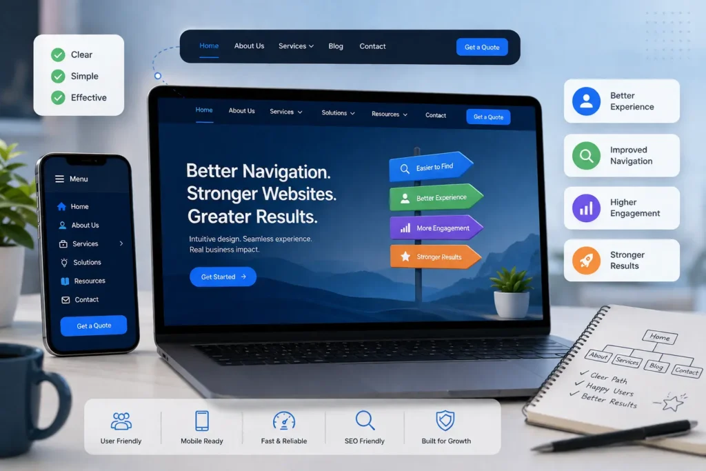
Website Navigation Best Practices That Create a Better User Experience
A website can have stunning visuals and compelling content, but if visitors struggle to find what they need, they won’t stay for long. Navigation is the framework that connects every page on your site, guiding users from their first click to the action you want them to take. Whether that action is making a purchase, requesting a quote, or reading another article, effective navigation makes the journey effortless.
Modern internet users expect websites to be intuitive, responsive, and easy to explore on any device. When menus are cluttered or page structures are confusing, frustration builds quickly, leading to higher bounce rates and lost opportunities. On the other hand, a thoughtfully organised navigation system encourages visitors to browse longer, engage with more content, and convert with confidence.
This guide explores practical website navigation strategies that improve usability, support search engine optimisation (SEO), and help create a seamless browsing experience for every visitor.
The Importance of Website Navigation
Navigation is one of the foundations of good web design. It influences how easily users move through your website and how effectively search engines understand your content.
Well-planned navigation offers several advantages:
- Helps visitors locate information quickly.
- Improves the overall browsing experience.
- Encourages users to explore additional pages.
- Increases trust by creating a professional, organised website.
- Supports SEO by improving site structure and internal linking.
When visitors can find what they need without confusion, they are far more likely to remain on your site and complete valuable actions.
Keep the Main Menu Clear and Focused
One of the simplest ways to improve usability is by reducing unnecessary menu items. Overloaded navigation can overwhelm visitors and make decision-making more difficult.
Your primary menu should highlight only the pages that are most important to your audience, such as:
- Home
- About Us
- Services
- Products
- Blog
- Contact
Additional information can be grouped under dropdown menus or placed in the website footer instead of overcrowding the main navigation.
A clean menu makes browsing faster and more intuitive.
Give Priority to High-Value Pages
Every page on your website serves a purpose, but some contribute more directly to your business goals than others.
Pages that generate enquiries, showcase services, or encourage purchases should receive greater visibility within your navigation. Positioning these links where users naturally look first can improve engagement and conversions.
Consider reviewing your menu regularly to ensure it reflects your current business priorities.
Use Straightforward Navigation Labels
Visitors should understand where a link will take them before they click it.
Avoid overly creative names that require users to guess their meaning. Instead, use clear, familiar wording such as:
- Services
- Pricing
- Portfolio
- Case Studies
- Blog
- Contact
Simple labels reduce uncertainty and help users navigate with confidence.
Maintain a Consistent Navigation Layout
Consistency is essential for creating a positive user experience.
Your navigation should appear in the same location and function identically across every page of your website. Unexpected changes force users to relearn how your website works, interrupting their browsing journey.
Consistency should apply to:
- Navigation placement
- Fonts and colours
- Dropdown styles
- Icons
- Active page indicators
- Link terminology
A familiar interface helps visitors navigate naturally.
Deliver a Mobile-Friendly Navigation Experience
With smartphones accounting for a significant share of web traffic, responsive navigation is no longer optional.
Your mobile menu should be easy to access, simple to understand, and comfortable to use with touch controls.
Effective mobile navigation includes:
- Clearly visible menu icons
- Large tap targets
- Logical menu organisation
- Fast loading performance
- Minimal scrolling through menu levels
A streamlined mobile experience keeps visitors engaged regardless of the device they use.
Avoid Overcomplicated Dropdown Menus
Dropdown menus are useful for organising content, but excessive nesting often creates confusion.
Instead of displaying long lists of links, group related pages into meaningful categories. For larger websites, carefully designed mega menus can provide an organised overview without overwhelming users.
The objective is to help visitors find information quickly—not make them search through endless options.
Add an Effective Search Feature
As websites grow, navigation alone may not be enough.
A search function allows users to locate specific content without browsing through multiple pages.
A good search experience should provide:
- Fast, accurate results
- Suggested search terms
- Tolerance for spelling errors
- Relevant recommendations
For online stores, combining search with filtering options further improves product discovery.
Build a Logical Website Structure
A well-structured website should guide users naturally from broad topics to more detailed information.
Keeping your hierarchy organised reduces unnecessary clicks and helps visitors understand how different sections relate to one another. Before creating or restructuring your navigation, it can also be helpful to follow a website design project planning guide to map out your pages, content hierarchy, user journeys, and key navigation paths from the beginning.
A clear structure makes it easier for both visitors and search engines to understand your website and find important content efficiently.
Use Breadcrumbs for Better Orientation
Breadcrumb navigation gives visitors a clear view of their current location within your website.
Example:
Home > Services > Website Development > Ecommerce Solutions
Breadcrumbs make it easier for users to move between categories while also strengthening internal linking and supporting search engine crawling.
They’re especially valuable for websites containing numerous service pages, product categories, or blog articles.
Make Navigation Easy to Recognise
Your navigation should be visually prominent without distracting from the rest of the page.
Effective navigation design includes:
- Easy-to-read text
- Adequate spacing
- Clear hover effects
- Visible active page highlighting
- Strong colour contrast
Visitors should instantly recognise where they are and where they can go next.
Focus on Speed and Performance
Navigation should respond immediately when users interact with it.
Heavy scripts, excessive animations, or poorly optimised code can introduce delays that frustrate visitors.
Improve performance by:
- Optimising JavaScript
- Compressing assets
- Reducing unnecessary visual effects
- Using lightweight icons
- Testing loading times across multiple devices
Fast websites create better user experiences while contributing to improved SEO performance.
Include Strong Calls-to-Action
Navigation should not only guide users—it should also encourage meaningful action.
Prominent buttons such as:
- Get a Quote
- Contact Us
- Schedule a Consultation
- Request a Callback
help direct visitors towards conversion-focused pages.
Using a contrasting button style helps these actions stand out from standard menu links.
Design with Accessibility in Mind
Accessible navigation ensures your website can be used by as many people as possible.
Important accessibility considerations include:
- Keyboard-friendly navigation
- Screen reader compatibility
- Descriptive link text
- Sufficient colour contrast
- Clearly visible focus states
- Semantic HTML elements
Improving accessibility benefits both users and overall website quality.
Reduce Unnecessary Navigation Steps
Visitors appreciate efficiency.
Important information should never feel buried beneath multiple layers of menus.
Review your website periodically to identify pages that require excessive clicks to reach. Simplifying navigation paths creates a smoother experience and helps users accomplish their goals faster.
Strengthen Internal Linking
Navigation extends beyond the main menu.
Adding relevant internal links within blog posts, service pages, and landing pages encourages visitors to continue exploring your website.
Strategic internal linking:
- Supports SEO
- Improves page discovery
- Keeps visitors engaged longer
- Guides users towards conversion pages
Every internal link should have a clear purpose and provide additional value.
Consider Using Sticky Navigation
Sticky headers remain visible while users scroll through a page, making navigation instantly accessible.
When implemented thoughtfully, they:
- Reduce scrolling back to the top
- Improve usability on long pages
- Increase access to key sections
However, sticky menus should remain compact so they don’t consume excessive screen space, especially on mobile devices.
Continuously Evaluate User Behaviour
Navigation improvements should be based on real user interactions rather than assumptions.
Use analytics tools, heatmaps, and usability testing to identify:
- Frequently visited pages
- Drop-off points
- Navigation bottlenecks
- Popular user journeys
Regular analysis allows you to refine your website structure and improve overall performance over time.
Common Navigation Mistakes to Avoid
Many websites unintentionally create obstacles for visitors through poor navigation choices.
Common issues include:
- Overcrowded menus
- Confusing menu labels
- Broken links
- Inconsistent layouts
- Deep navigation structures
- Poor mobile usability
- Tiny clickable elements
- Missing search functionality
- Slow menu loading
Addressing these problems can significantly improve both usability and visitor satisfaction.
Keep Your Navigation Updated
As your business evolves, your website should evolve with it.
Adding new services, products, or resources without reviewing your navigation can gradually make your website difficult to browse.
Perform routine navigation audits to:
- Remove outdated content
- Reorganise categories
- Merge duplicate pages
- Update menu priorities
- Simplify the overall site structure
Regular maintenance ensures your website remains user-friendly as it grows.
Final Thoughts
Website navigation has a direct impact on how visitors perceive and interact with your business online. An organised, intuitive navigation system helps users locate information efficiently, increases engagement, and creates a more enjoyable browsing experience.
By simplifying menus, using familiar labels, maintaining consistency, optimising for mobile devices, strengthening internal linking, improving accessibility, and reviewing user behaviour regularly, you can create a website that is easy to navigate for both users and search engines.
Investing in better navigation isn’t just about usability—it contributes to stronger SEO performance, higher conversion rates, and long-term customer satisfaction.
Improve Your Website Navigation with Horizon Services
If your current website feels difficult to navigate or no longer meets modern user expectations, professional guidance can make all the difference. At Horizon Services, we create bespoke websites that combine attractive design, intuitive navigation, responsive development, and SEO-focused architecture to deliver outstanding digital experiences.
Whether you’re planning a complete redesign or enhancing an existing website, our team can build a solution that helps visitors find information quickly and encourages more enquiries and conversions.
Contact Horizon Services today to learn how our website design and development company in Watford can help your business create a user-friendly website that delivers measurable results.


