In the modern digital landscape, a website is often the very first point of contact between a business and its potential customers. Whether someone discovers your brand through search engines, social media platforms, or online advertisements, their initial experience on your website can strongly influence their decision to stay or leave within seconds. This is exactly where responsive web design becomes essential.
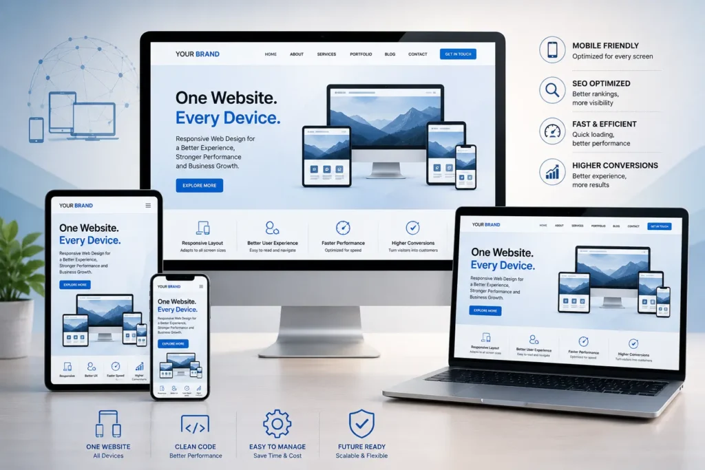
Responsive web design is no longer just a modern feature—it has become a basic necessity for any business that wants to remain competitive, deliver a smooth user experience, and perform well in search engine rankings.
In this article, we will explore what responsive web design services are, how they function, and why they play a critical role in today’s digital success.
Understanding Responsive Web Design Services
Responsive web design services involve designing and developing websites that automatically adjust and adapt to different screen sizes and devices. This ensures that a website delivers a consistent and user-friendly experience across all platforms, including:
- Mobile phones
- Tablets
- Desktop computers
- Laptops
- Large displays and smart screens
Instead of creating separate versions of a website for different devices, responsive design uses flexible layouts, scalable images, and CSS media queries to ensure the content adapts seamlessly.
In simple terms, it means one website that works perfectly everywhere.
A professional agency such as Horizon Services focuses on building responsive websites that are visually appealing, highly functional, and optimized for all devices.
How Responsive Web Design Actually Works
Responsive design is built on a few important technical foundations that work together to create adaptability across devices.
Flexible Grid Systems
Instead of using fixed-width layouts based on pixels, responsive websites rely on proportional grids. These grids resize elements relative to the screen size, allowing layouts to adjust naturally.
For instance, a multi-column layout on a desktop may automatically transform into a single-column layout on a smartphone for better readability.
Adaptive Images and Media
Images and videos are designed to scale within their containers so they never overflow or distort the layout. This ensures a clean and consistent appearance across all screen sizes.
Techniques often used include:
- Maximum width settings in CSS
- Responsive image scaling
- Optimized image compression for faster loading
CSS Media Queries
Media queries allow developers to apply specific styles depending on the device characteristics such as screen width or resolution.
For example:
- Mobile users may see simplified layouts with larger buttons
- Desktop users may experience more detailed multi-column layouts
Together, these elements ensure a smooth and adaptive user experience.
The Importance of Responsive Web Design Services
Responsive design is not just about visual appearance. It plays a major role in usability, performance, and business growth.
Let’s look at why it matters so much.
Growing Mobile Internet Usage
A large portion of global internet traffic now comes from mobile devices. In regions like India and the UK, mobile browsing has become the primary way users access websites.
If your website is not mobile-friendly, you risk losing a significant share of your audience.
Non-responsive websites often create problems such as:
- Excessive scrolling
- Difficult navigation
- Poor readability
- Frustrating user experience
These issues often lead users to leave the site quickly.
Enhanced User Experience
User experience is one of the most important factors in web success. Responsive websites ensure visitors can:
- Read content without zooming in
- Navigate menus easily
- Interact with buttons smoothly
- Enjoy a consistent interface across all devices
When users have a positive experience, they are more likely to stay longer and engage with your content.
Stronger SEO Performance
Search engines like Google prioritize websites that are mobile-friendly and responsive.
Responsive design improves SEO by:
- Reducing bounce rates
- Improving mobile usability scores
- Enhancing page loading speed
- Avoiding duplicate content issues (single unified website)
With Google’s mobile-first indexing system, the mobile version of your website plays a major role in ranking decisions.
Faster Loading Speeds
Website speed is crucial for both user satisfaction and search rankings. Responsive websites are optimized to load efficiently across devices by:
- Loading device-appropriate resources
- Compressing images automatically
- Eliminating unnecessary scripts on mobile
A faster website keeps users engaged and reduces drop-offs.
More Cost-Effective Solution
Earlier, businesses often had to build separate websites for desktop and mobile users. This approach required more time, effort, and maintenance costs.
Responsive design eliminates that need by offering:
- A single website for all devices
- Easier updates and maintenance
- Reduced development costs
- Consistent branding across platforms
This makes it a more efficient long-term investment.
Higher Conversion Potential
A well-optimized responsive website significantly improves conversion rates. Whether your goal is:
- Selling products online
- Generating business leads
- Getting service inquiries
- Increasing registrations or bookings
A smooth user experience encourages visitors to complete desired actions without friction.
Even small usability improvements can lead to noticeable business growth.
Long-Term Digital Flexibility
Technology continues to evolve, and new devices with different screen sizes are constantly emerging.
Responsive design ensures that your website:
- Automatically adapts to future devices
- Requires fewer redesign updates
- Remains scalable and future-ready
This makes it a sustainable solution for long-term digital growth.
Essential Features of Professional Responsive Design Services
When businesses hire experienced professionals, they receive much more than just a mobile-friendly website. They get a complete digital solution focused on performance and growth.
Key features include:
Tailored Website Design
Custom layouts that reflect your brand identity and business objectives.
Cross-Platform Compatibility
Smooth performance across all browsers and devices.
SEO-Friendly Structure
Proper optimization to help improve search engine visibility.
Performance Optimization
Fast and efficient website loading across all platforms.
Scalable Design Framework
A structure that supports future expansion and updates.
Common Problems with Non-Responsive Websites
Many outdated websites still suffer from poor responsiveness, leading to issues such as:
- Fixed layouts that break on smaller screens
- Text that is too small to read comfortably
- Misaligned elements on mobile devices
- Slow page loading times
- Confusing navigation structure
These issues can harm both user trust and brand reputation.
Industries That Rely Heavily on Responsive Design
While all businesses benefit from responsive websites, some industries depend on them more heavily, including:
- Online retail and e-commerce
- Healthcare providers
- Real estate agencies
- Education and e-learning platforms
- Travel and hospitality businesses
- Software and technology companies
In these sectors, users frequently switch between devices, making responsiveness critical.
Why Professional Services Make a Difference
Although website builders offer basic templates, they often lack advanced customization, optimization, and scalability.
Professional agencies provide:
- Strategic and goal-oriented design
- High-performance development standards
- Advanced SEO and speed optimization
- Long-term technical support and scalability
This ensures your website not only looks good but also delivers measurable results.
A trusted team like Horizon Services helps businesses build powerful, responsive websites designed for real-world performance and growth.
Conclusion
Responsive web design is no longer optional in today’s digital world—it is essential.
It influences how users interact with your brand, how search engines rank your website, and how effectively your business converts visitors into customers.
A properly designed responsive website delivers:
- Better user experience
- Stronger search visibility
- Faster performance
- Higher conversion rates
- Long-term adaptability
If your website is not yet optimized for all devices, now is the right time to upgrade.
Grow Your Business with Horizon Services
To build a strong, modern, and fully optimized online presence, expert support can make a significant difference.
Horizon Services, a Watford-based full-service digital agency, specializes in crafting responsive, high-performance websites that help businesses grow online.Explore professional responsive web design services in UK and elevate your digital presence with a website that performs flawlessly across every device.


